


Usability is an integral part of holistic SEO. It influences factors such as bounce rate, time on page and conversion rate, to name a few, and many of these metrics affect your website’s SEO. Optimizing usability is essential for all sites, but even more so for eCommerce sites.
User testing is one way to optimize your eCommerce shop — read our introduction to user testing to get started –, but a lot can be done just by looking at best practice, comparing that with your site and making improvements. This ultimate guide to eCommerce websites takes you through that testing process and looks at everything you need to address to give your visitors the best experience possible.
In short, this usability guide for online shops will tell you all about:
- Internal search
- Product page optimization
That’ll cover most, if not all of your visitors’ on-site shopping experience. Let’s get started!
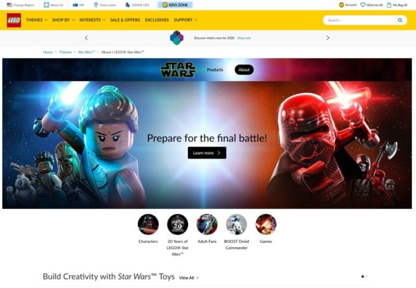
Online store homepage usability 101
Have you ever looked closely at the homepage of your online shop? Chances are you just went with the WooCommerce theme that your designer presented and implemented the available options. While most of these themes are nicely designed and set up with the user in mind, that might not be best for your particular target audience.
Focus on your target audience
Before setting up a design, you need to understand the needs of your target audience. You need to investigate the search intent. Are your potential customers looking for the best price, or do they want to read a dozen reviews before buying? Are there cultural differences you need to take into account? These things determine the setup and layout of your shop’s homepage. Do you need to highlight sale items? Are you addressing a particular niche? If so, you’ll need to make that clear from the start.
If one of the pillars of your mission is to provide the best price possible, the sale banner should probably be the most prominent item on your homepage. But, if you are selling high-quality products that people are willing to pay a bit more for, sentiment and emotion should be your focus. You could use larger images and focus on core product features and benefits.
Homepage call-to-action
The job of your homepage is to guide the visitor to your products. The homepage of your online store shouldn’t necessarily be set up with SEO in mind but should focus on the user instead. That also means you’ll have to create a killer call-to-action on that homepage. Not having a great CTA is one of the most common SEO mistakes. Here are some useful tips for setting up that call-to-action:
- Make sure it stands out from the design. Use a different color or button shape.
- Use active text, so your button shouldn’t say ‘Submit’ but rather a variation of ‘buy our stuff’.
- Use plenty of whitespace around it, or reduce clutter.
- Using a hero image is popular these days and for good reason: it sets a mood.
After welcoming the visitor to your website, you can guide them to where you make your money: the product pages. Before we address these, let’s look at how to optimize internal search, and category/landing pages.
Internal search
Internal search is the most important navigational option for your online store, and you should optimize it to the max. You’ll have noticed that the larger brands and online stores all focus a lot on their internal search. The reason is simple: if you can find the product you are looking for, you can buy it!
As well as optimizing that internal search option, you need to make sure that your search result pages look focused and give a great overview. You need to show the price and even an ‘Add to Cart’ button next to the product’s name and image, and a comparison option will come in handy if, for example, you have a shop selling Bluetooth speakers.
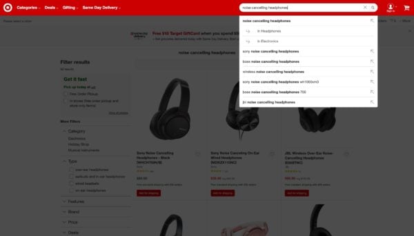
Filter options
After the search query, online clothing shops will allow for filtering by size, gender, color – the lot. Filtering options like these, or sorting by price or availability, will help your visitor to find the product they want as quickly as possible. To read more about this and see some examples, I recommend my post Enhance online shopping with eCommerce filters.
Category page optimization
Your category pages could be even more important than your product pages because these are the main entry points for customers. In addition, these give customers the option to choose and compare, much like your internal search result pages. Your shop category page should be considered a regular page for SEO, but is so much more important when it comes to usability.
Here are some of the things you need to keep in mind:
- Make sure the page has a valuable piece of content — preferrably at the top of the page. It’s the glue that holds your products together and one of the reasons the potential buyer ended up here. Even if they scroll right to the product listings, they’ll appreciate the extra information (and Google certainly does).
- List all other categories as well, or at least make them accessible via a drop-down, especially when you have a lot of categories like Amazon does. It makes more sense to make them available rather than listing them all. But if your shop only has ten categories, list them, for example in a sidebar or footer menu.
- Product listings need a proper call-to-action, so don’t hide it. Add a button.
- The product image in the listing will help convince the visitor to click, buy or compare an item. Use good quality, stunning images that display the product well.
- Optimize the product title, for example by including the SKU as well. As well as having SEO benefits, people searching for specific products – like that one particular Lego set they are looking for – will thank you for it.
- State whether a product is available. Nothing is more disappointing than finally finding the product you want only to find out it’s sold out when you get to the shopping cart. Add a notice to the category page listing instead.
You should also optimize your landing pages.
Landing page optimization
A landing page is a page where your visitors end up when they follow a link from outside the site, for example search engines or social media. Landing pages on your online shop should be optimized to evoke a particular reaction from the visitor, such as buying a specific product.
Focus on one product or product bundle and optimize that page to guide your visitor to the purchase — in other words, welcome them. Make sure the visitor feels safe paying you by setting up HTTPS on your site and maybe adding trust signals. Add social proof in the form of testimonials, so your visitor will understand why your product is so good, and why they need it.
We strongly recommend using headings and images to deliver your message as these help a lot, particularly for buyers scanning your landing page. Make sure these deliver the right message to your visitors.
To find out more about landing pages, see our article Landing pages and why they matter.
And so, on to product pages.
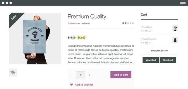
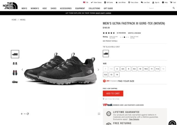
Product page optimization
Generally speaking, make your product page as usable as possible. Product pages need to be optimized for SEO, by using Schema.org data, for instance. If your shop runs on WooCommerce, our WooCommerce SEO plugin helps with a lot of these things. Read more about product pages in our article on product page SEO. But when your visitor arrives on that page, you need to convince them to buy.
Best practices
Let’s go over some best practices for product pages:
- Create scarcity: if you have only a limited number of products available, that will encourage visitors to buy. But be honest about the numbers.
- In stock or not? Be clear about that, as it will help manage visitor expectations.
- Add to cart AND add to wish list. People might not want to purchase right away for budget or other reasons.
- Offer product bundles. Buy this and that, as these products belong together. You might offer a discount for that bundle as a sales promotion.
- Free shipping, or free shipping on any orders over a certain amount. It’s a nice gesture and yet another reason to buy from you.
- , people who bought this product also bought that product, etc. If you show them more products, they might spend more money.
- Show people using the product (as a part of your product images). People will find it easier to relate to and see why they need your product.
Call-to-action
Just like your homepage, your product page needs a strong call-to-action. In most cases that will be the Add to Cart button. Limit all distractions, make the text actionable, and use the right color. And if possible, add a review somewhere near that button. There’s more on calls-to-action here, and more on button design here.
There are more details and real-life examples in our product page UX article, and there are more insights on creating trust in this article: 7 ways to increase sales by creating trust. Our post on testimonials and reviews offers some great insights, and you should also read our post on The psychology of discounts.
After your product page, customers proceed to your shopping cart, which is part of your checkout process.
Checkout page optimization
Shopping cart abandonment
There are many reasons why people might leave your website without buying anything. They might even put products into their cart, only to abandon it. In our post on Shopping cart abandonment, we go over what might lead to this, like:
- “I wanted to do more research.”
- “I found it cheaper elsewhere.”
- “I wanted to wait for it to go on sale.”
For mobile carts, there are even more reasons, like loading speed and poor design. Investigating this will make your online shop better and can increase your sales.
You are about to close the deal: the customer wants to buy your product, so let’s gently guide them to our payment page. The first thing we need is to tell them where we are in the checkout process, so be sure to add a progress bar.
At the start of the checkout process, we give the customer an overview of the products they want to buy. This is, of course, the same as the cart overview. There are a couple of elements that are required here:
- Product image, even a small one will confirm to the soon-to-be customer that the right product is in the cart.
- Prices, not just the price of one item, but also the number of items and the total price.
- Additional costs, like shipping costs. There should be no extra surprise costs after the cart overview.
- Payment options, just to let the customer know how they can pay.
- Security signs, like the green padlock and address bar for SSL sites, plus perhaps extra logos like Trustpilot right below the cart overview.
Guest purchase
You should also make sure a guest purchase is possible. Having to register for a one-time sale is a deal-breaker for me.
Short forms
If you need to ask for more than just an email address, make sure to make the form as short as possible. Think about useful things like a checkbox to confirm that the delivery and invoice address are the same, instead of making customers fill in their details twice.
Payment
Make payment easy by choosing a trusted payment provider and offering convenient payment options. These will vary depending on the shop and its customer base.
Finally, after that optimized shopping process, a happy customer will leave your online shop. Now make sure you keep that customer happy. There are some extra things you can do to make that happen and you’ll find more tips in our article on checkout page UX!
Optimize site speed
Today, every shopper expects sites to load quickly. It doesn’t make sense to wait age for one site to load while the competitor loads in just a couple of seconds. Seconds truly count here. Google hasn’t deemed site speed a ranking factor for nothing, you know. Do everything you can to speed up those pages! We have several posts on site speed, with site speed tools and more on how to check — and think about — site speed.
Conclusion: eCommerce usability is a trade of its own
Don’t trust your theme or eCommerce platform to fill in the blanks for you. Put some real effort into optimizing the usability of your eCommerce website. You’ll find that a better user experience will bring the SEO and conversion of your online store to the next level.
Read more: WordPress SEO: The definitive guide to higher rankings for WordPress sites »
The post eCommerce usability: the ultimate guide appeared first on Yoast.
This content was originally published here.